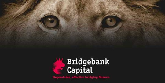
A great example of branding continuity, advertising campaigns are designed to work across a range of media with concepts needing to being fresh, whilst retaining a corporate guidance. Bridgebank Capital primarily required a series of adverts and emailers to increase brand awareness and a push on their USP’s. Following the success of this project we continued the
American Car Magazine – Redesign
Advertising, Branding, Design, Marketing, Print
A new corporate identity and a complete re-design of the current ‘American Car World’ magazine. Result Every aspect of the design down to the tiniest detail was reworked to create a complete new identity that was fresh, bold and looked fantastic. Feedback ‘Our readers and advertisers are astonished by the transformation and we have Creative Blue
Dante Cenci – Jewellery Brochure
Design, Print
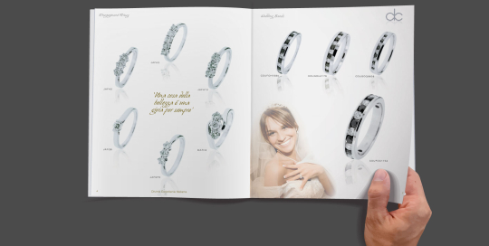
The client required one brochure to display both 'Wedding rings' and 'Fine jewellery' with an obvious separation of product. The design of this 32pg brochure made full use of a 'Double Cover' to work as 'flip and turn'. The result was a dual brochure with two obvious sections whilst retaining the design characteristics of one brochure.
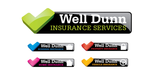
Well Dunn Insurance services – Branding
Branding, Design, Email marketing, Print, Website Design, WordPress
Well Dunn Insurance services required an identity to produce a full range of products but to also remain memorable within the insurance sector. With the company name 'Well Dunn' it became obvious that we need to play on this and the 'Well Dunn' tick was developed. An ideal graphic to drive a positive proposition. Contact
