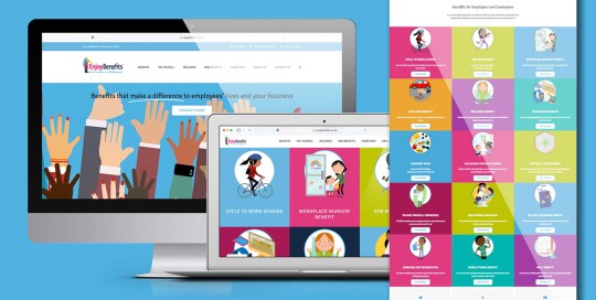
Enjoy Benefits approached Creative Blue Design with initial requirements of creating a good email marketing campaign. Visuals were produced and we are happy to say that on the back of this we given more marketing and promotional materials along with the trusted task of creating a new, fresh website. Amanda, Director at Enjoy Benefits said: "At
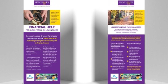
The University of Manchester
Branding, Design, Print
The University of Manchester needed a quick turnaround for a specific project requiring; 5 x roller banners and 200 of 2 types of leaflets. Design had to be eye-catching, relevant and adhere to established brand guidelines. This is exactly what Creative Blue Design delivered. The Client said: "Great service. Creative Blue Design’s intuitive design skills helped
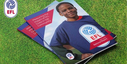
EFL National Report 2023
Brochure, Design
The English Football League produced a new report highlighting the significant role that its 72 Clubs play in supporting communities across England and Wales. Working with strong brand guidelines, the 80 page report delivered a visually pleasing breakdown of data in a clear and concise design. Delivered print ready within a tight deadline, the client was
Quantum – Creating a Brand
Advertising, Branding, Design, Email marketing, Print, Website Design
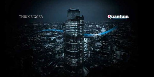
Bridgebank Capital wanted to create a separate sector within the business and so Quantum was created. Branding creation not simply down to a logo and strapline but a true branding exercise to dictate the tone of its advertisements and how it is perceived by the target audience. In turn a logo with familiarity was created to sit within

Mortgage Rate Cover – Creating a brand
Advertising, Branding, Design, Email marketing, Marketing, Mobile, Website Design
Mortgage Rate Cover was launched as a product to facilitate a rise in mortgage payments for a select market who may not be able to re-mortgage or for those wishing to retain their existing mortgage and be covered in such an eventuality. The brand had to be professional yet approachable whilst emulating a protective element. After presenting three strong
Well Dunn Insurance services – Branding
Branding, Design, Email marketing, Print, Website Design, WordPress
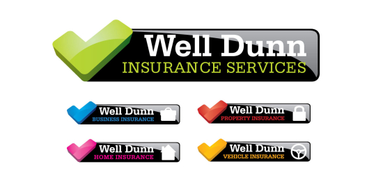
Well Dunn Insurance services required an identity to produce a full range of products but to also remain memorable within the insurance sector. With the company name 'Well Dunn' it became obvious that we need to play on this and the 'Well Dunn' tick was developed. An ideal graphic to drive a positive proposition. Contact
LUMI paper – Product Profile Increase
Design, Marketing, Print
Project To raise the profile of their ‘Lumi’ paper range within the printing industry. Result An ‘out of this world’ sci-fi theme was used to show how well the paper displays with rich, full colour images. A sample book started the campaign followed by special edition 3D prints and monthly posters.
